
Appendix3.Matplotlib
Appendix3. Matplotlib
Matplotlib에서 Tool사용방법을 알아봤으나, 기초적인 부분에 대해서만 알아보고 많이 부족하다는 것을 깨달았다.
따라서 이번 Post는 Hands-on ML에서 부록 중 하나인 Matplotlib사용법을 알아보는 Post이다. (수학적인 요소를 어떻게 Matplotlib으로서 Visualziation할 지 매우 잘 나타내었다.)
코드참조:Handson-ml2 Github
필요한 Library import
실제 matplotlib은 다양한 Python의 backend graphics libraries를 통하여 다른 Window에서 결과를 보여주는 방식이 많다. %matplotlib inline을 통하여 JupyterNotebook내에서 결과를 보여주게 Setting한다.
1
2
3
4
5
6
7
import matplotlib
import matplotlib.pyplot as plt
import numpy as np
from numpy.random import rand
from numpy.random import randn
import os
%matplotlib inline
Plotting your first graph
- plot: 실제 Data의 값을 입력
- show: 결과를 확인. 기본적으로 y의 값만 입력으로 넣을 수 있고, x,y의 값을 둘 다 입력으로 줄 수 있다.
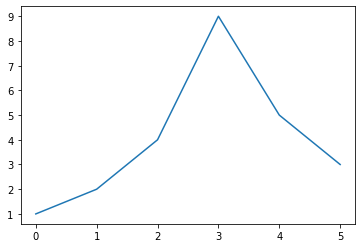
y의 값만 주는 경우(기본적인 x의 값을 Index가 된다.)
1
2
plt.plot([1,2,4,9,5,3])
plt.show()
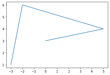
x,y의 값을 같이주는 경우
1
2
plt.plot([-3,-2,5,0],[1,6,4,3])
plt.show()
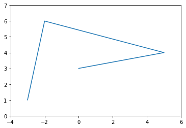
axis를 활용하여 각각의 x,y축의 범위를 지정할 수 있다. -> [xmin,xmax,ymin,ymax]
1
2
3
plt.plot([-3,-2,5,0],[1,6,4,3])
plt.axis([-4,6,0,7])
plt.show()
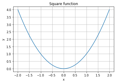
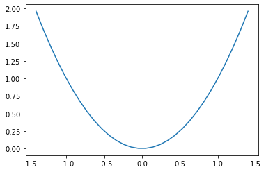
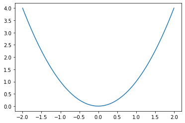
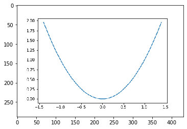
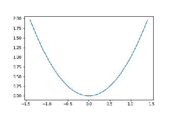
numpy를 활용하여 Discrete한 값이 아니라 Array로서 값을 Plot할 수 있다.
numpy.linspace(): 일정한 범위의 값을 Same Interval로서 나눌 수 있다.
1
2
3
4
5
6
# -2 ~ 2까지의 범위를 500개로서 나눈다.
x = np.linspace(-2,2,500)
y = x**2

plt.plot(x,y)
plt.show()

- .grid: plt Image에 눈금을 넣을 수 있따.
- .title: plt Image의 제목
- .xlabel: plt x축의 이름
- .ylabel: plt y축의 이름
1
2
3
4
5
6
plt.plot(x,y)
plt.title('Square function')
plt.xlabel("x")
plt.ylabel("y")
plt.grid(True)
plt.show()
Line style and color
matplotlib은 연속적인 값들에 대하여 Line으로 나타낼 수 있다.
1
2
3
4
5
6
7
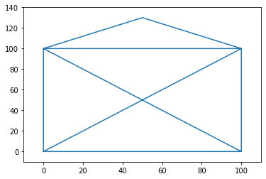
# 0,0 -> 100,0: line_1
# 100,0 -> 0,100: line_2
# 0,100 -> 100,100: line_3
# ...
plt.plot([0, 100, 100, 0, 0, 100, 50, 0, 100], [0, 0, 100, 100, 0, 100, 130, 100, 0])
plt.axis([-10, 110, -10, 140])
plt.show()
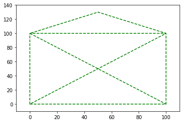
plt.plt의 3번째 OPtion으로서 선이나 Marker의 Style을 나타낼 수 있다.
1
2
3
4
# g--: Green dashed line
plt.plot([0, 100, 100, 0, 0, 100, 50, 0, 100], [0, 0, 100, 100, 0, 100, 130, 100, 0], "g--")
plt.axis([-10, 110, -10, 140])
plt.show()
plt.plot은 각각의 Line에 대하여 지정할 수 있다. x1,y1,[style1],x2,y2,[style2],...
1
2
3
plt.plot([0, 100, 100, 0, 0], [0, 0, 100, 100, 0], "r-", [0, 100, 50, 0, 100], [0, 100, 130, 100, 0], "g--")
plt.axis([-10, 110, -10, 140])
plt.show()
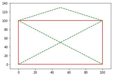
plt.show()를 부르기 전까지의 plt은 하나의 Image에 기록된다.
1
2
3
4
plt.plot([0, 100, 100, 0, 0], [0, 0, 100, 100, 0], "r-")
plt.plot([0, 100, 50, 0, 100], [0, 100, 130, 100, 0], "g--")
plt.axis([-10, 110, -10, 140])
plt.show()

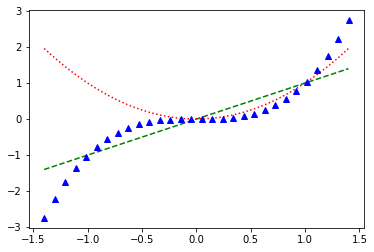
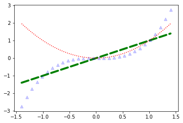
선뿐만 아니라 Point에 대해서도 나타낼 수 있다.
참조: Matplotlib style & color
1
2
3
4
5
6
x = np.linspace(-1.4, 1.4, 30)
# g--: green dashed
# r: red small dashed
# b^: blue triangle point
plt.plot(x, x, 'g--', x, x**2, 'r:', x, x**3, 'b^')
plt.show()
plot function은 list of Line2D objects를 반환한다.
따라서 반환받은 Object에 따라서 각각의 Style(두께, 투명도 등…)을 따로 지정할 수 있다.
참조: full list of attributes
1
2
3
4
5
6
7
8
9
x = np.linspace(-1.4, 1.4, 30)
line1, line2, line3 = plt.plot(x, x, 'g--', x, x**2, 'r:', x, x**3, 'b^')
# 선의 두께
line1.set_linewidth(4.0)
# 선의 끝 부분 Style
line1.set_dash_capstyle("round")
# 투명도
line3.set_alpha(0.2)
plt.show()
Saving a figure
savefig를 통하여 Figure를 저장할 수 있다.
저장할 수 있는 File Format은 사용하는 graphics backend에 따라 다르다.
1
2
3
4
x = np.linspace(-1.4, 1.4, 30)
plt.plot(x, x**2)
plt.savefig("my_square_function.png", transparent=True)
print(os.listdir(os.getcwd()))
1
['.ipynb_checkpoints', 'Appendix3.matplotlib.ipynb', 'my_square_function.png']
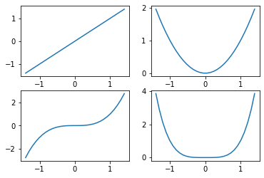
Subplots
하나의 matplotlib figure은 다양한 subplots를 포함한다. 이러한 subplots는 왼쪽 -> 오른쪽, 위쪽 -> 아래쪽으로 Grid형식으로 지정된다.
1
2
3
4
5
6
7
8
9
10
x = np.linspace(-1.4, 1.4, 30)
plt.subplot(2, 2, 1)  # 2 rows, 2 columns, 1st subplot = top left
plt.plot(x, x)
plt.subplot(2, 2, 2)  # 2 rows, 2 columns, 2nd subplot = top right
plt.plot(x, x**2)
plt.subplot(2, 2, 3)  # 2 rows, 2 columns, 3rd subplot = bottow left
plt.plot(x, x**3)
plt.subplot(2, 2, 4)  # 2 rows, 2 columns, 4th subplot = bottom right
plt.plot(x, x**4)
plt.show()
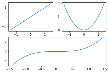
같은 크기의 subplot말고 다른 크기의 subplot생성은 다음과 같이 지정하면 된다.
1
2
3
4
5
6
7
plt.subplot(2, 2, 1)  # 2 rows, 2 columns, 1st subplot = top left
plt.plot(x, x)
plt.subplot(2, 2, 2)  # 2 rows, 2 columns, 2nd subplot = top right
plt.plot(x, x**2)
plt.subplot(2, 1, 2)  # 2 rows, *1* column, 2nd subplot = bottom
plt.plot(x, x**3)
plt.show()
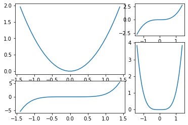
subplot2gird를 활용하여 subplot보다 더 정교하게 나타낼 수 있다.
전체적인 크기를 지정한 뒤 위치과 sub figure의 row, col Size까지 지정할 수 있다.
참조: Subplot 자세한 내용
1
2
3
4
5
6
7
8
9
plt.subplot2grid((3,3), (0, 0), rowspan=2, colspan=2)
plt.plot(x, x**2)
plt.subplot2grid((3,3), (0, 2))
plt.plot(x, x**3)
plt.subplot2grid((3,3), (1, 2), rowspan=2)
plt.plot(x, x**4)
plt.subplot2grid((3,3), (2, 0), colspan=2)
plt.plot(x, x**5)
plt.show()
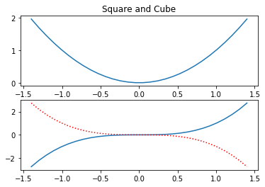
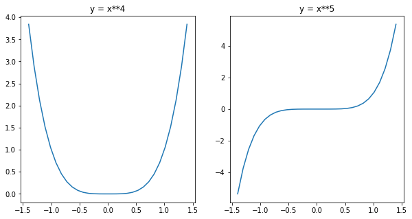
Multiple figure
위의 subplot은 하나의 Figure에 여러가지 subplot을 그리는 방법이였다면, 이번에는 Figure자체를 여러개 사용할 수도 있다.
이전까지의 matplotlib은 figure(1)을 자동 생성하였다고 생각하면 된다.
이전 Figure를 부르게 되면 자동적으로 Figure안의 마지막에 사용하던 Subplot으로 Data를 집어넣는 다는 것을 기억해야 한다.
1
2
3
4
5
6
7
8
9
10
11
12
13
14
15
16
17
18
19
20
21
x = np.linspace(-1.4, 1.4, 30)

plt.figure(1)
plt.subplot(211)
plt.plot(x, x**2)
plt.title("Square and Cube")
plt.subplot(212)
plt.plot(x, x**3)

plt.figure(2, figsize=(10, 5))
plt.subplot(121)
plt.plot(x, x**4)
plt.title("y = x**4")
plt.subplot(122)
plt.plot(x, x**5)
plt.title("y = x**5")

plt.figure(1)      # back to figure 1, current subplot is 212 (bottom)
plt.plot(x, -x**3, "r:")

plt.show()
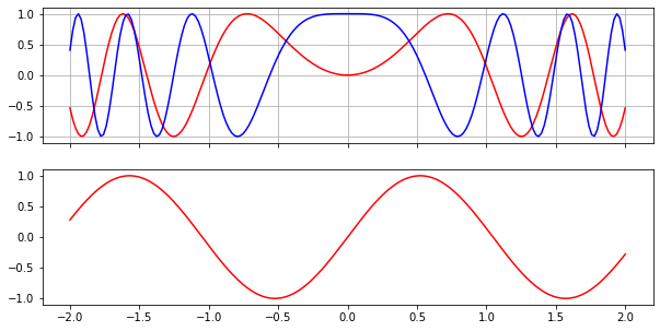
Pyplot’s state machine: implicit vs explicit
이전까지의 Pyplot은 Active한 Subplot을 자동적으로 불러오게 되는 implict(암시적)이였다.
이러한 implict는 대상이 매번 바뀔 수 있으므로, 해당 저장는 explicit하게 변경하는 것을 권장하고 있다.
즉, Figure, Subplot을 Object로 반환받아서 각각의 Object에 Data를 넣는 형식(Object-Oriented)을 추천하고 있다.
1
2
3
4
5
6
7
8
9
10
11
12
x = np.linspace(-2, 2, 200)
# Return Object, Subplot1, Subplot2
fig1, (ax_top, ax_bottom) = plt.subplots(2, 1, sharex=True)
fig1.set_size_inches(10,5)
# Return Line1, Line2
line1, line2 = ax_top.plot(x, np.sin(3*x**2), "r-", x, np.cos(5*x**2), "b-")
line3, = ax_bottom.plot(x, np.sin(3*x), "r-")
ax_top.grid(True)

fig2, ax = plt.subplots(1, 1)
ax.plot(x, x**2)
plt.show()
Drawing text
Matplotlib에서 Graph를 그리는 것도 중요하지만 Text또한 중요하다.
기본적으로 Text크기, 폰트, 회전각도, 색 등을 지원하고 또한 Latex 문법 또한 지원한다.
참조: LaText 문법
참조: Matplotlib Text
1
2
3
4
5
6
7
8
9
10
11
12
13
14
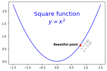
x = np.linspace(-1.5, 1.5, 30)
px = 0.8
py = px**2
plt.plot(x, x**2, "b-", px, py, "ro")
# (0,1.5)-> Location, fintsize -> 글자 크기, color -> 글자 색깔, horizontalalignment -> x,y를 기준으로 Text의 위치
plt.text(0, 1.5, "Square function\n$y = x^2$", fontsize=20, color='blue', horizontalalignment="center")
# weight -> 글자 두께
plt.text(px - 0.08, py, "Beautiful point", horizontalalignment="right", weight="heavy")
# rotation -> 회전 각도
plt.text(px, py-0.25, "x = %0.2f\ny = %0.2f"%(px, py), rotation=50, color='gray')
plt.show()
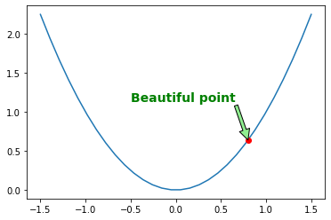
annotate를 사용하게 되면 Text가 Point를 화살표로 지정하며 보기 쉽게 Visualization할 수 있다.
1
2
3
4
5
plt.plot(x, x**2, px, py, "ro")
plt.annotate("Beautiful point", xy=(px, py), xytext=(px-1.3,py+0.5),
                           color="green", weight="heavy", fontsize=14,
                           arrowprops={"facecolor": "lightgreen"})
plt.show()
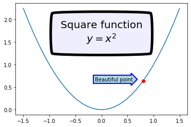
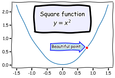
bbox attribute를 활용하여 Bounding Box를 설정할 수 있다.
1
2
3
4
5
6
7
8
9
plt.plot(x, x**2, px, py, "ro")

bbox_props = dict(boxstyle="rarrow,pad=0.3", ec="b", lw=2, fc="lightblue")
plt.text(px-0.2, py, "Beautiful point", bbox=bbox_props, ha="right")

bbox_props = dict(boxstyle="round4,pad=1,rounding_size=0.2", ec="black", fc="#EEEEFF", lw=5)
plt.text(0, 1.5, "Square function\n$y = x^2$", fontsize=20, color='black', ha="center", bbox=bbox_props)

plt.show()
xkcd를 사용하여 matplolip을 style을 설정할 수 있다.
1
2
3
4
5
6
7
8
9
10
with plt.xkcd():
    plt.plot(x,x**2,px,py,'ro')

    bbox_props = dict(boxstyle='rarrow, pad=0.3',ec='b',lw=2,fc='lightblue')
    plt.text(px-0.2, py, "Beautiful point", bbox=bbox_props, ha="right")

    bbox_props = dict(boxstyle="round4,pad=1,rounding_size=0.2", ec="black", fc="#EEEEFF", lw=5)
    plt.text(0, 1.5, "Square function\n$y = x^2$", fontsize=20, color='black', ha="center", bbox=bbox_props)

    plt.show()
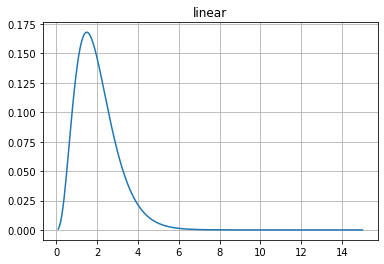
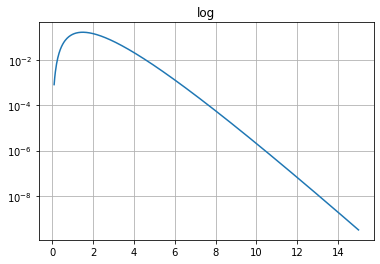
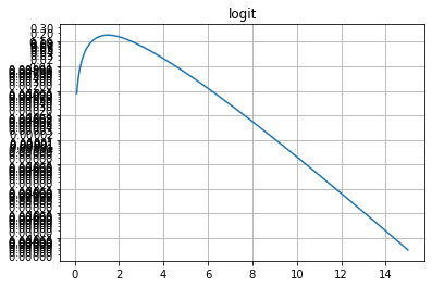
Non linear scales
matplotlib은 linear, log, logit, symlob등 다양한 Non linear scales 를 지원한다.
\(logit = log(\frac{p}{1-p})\)
1
2
3
4
5
6
7
8
9
10
11
12
13
14
15
16
17
18
19
20
21
22
23
24
25
26
27
28
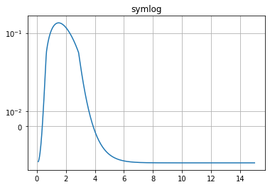
x = np.linspace(0.1, 15, 500)
y = x**3/np.exp(2*x)
plt.figure(1)
plt.plot(x, y)
plt.yscale('linear')
plt.title('linear')
plt.grid(True)
plt.figure(2)
plt.plot(x, y)
plt.yscale('log')
plt.title('log')
plt.grid(True)
plt.figure(4)
plt.plot(x, y)
plt.yscale('logit')
plt.title('logit')
plt.grid(True)
plt.figure(5)
plt.plot(x, y - y.mean())
plt.yscale('symlog', linthreshy=0.05)
plt.title('symlog')
plt.grid(True)
plt.show()
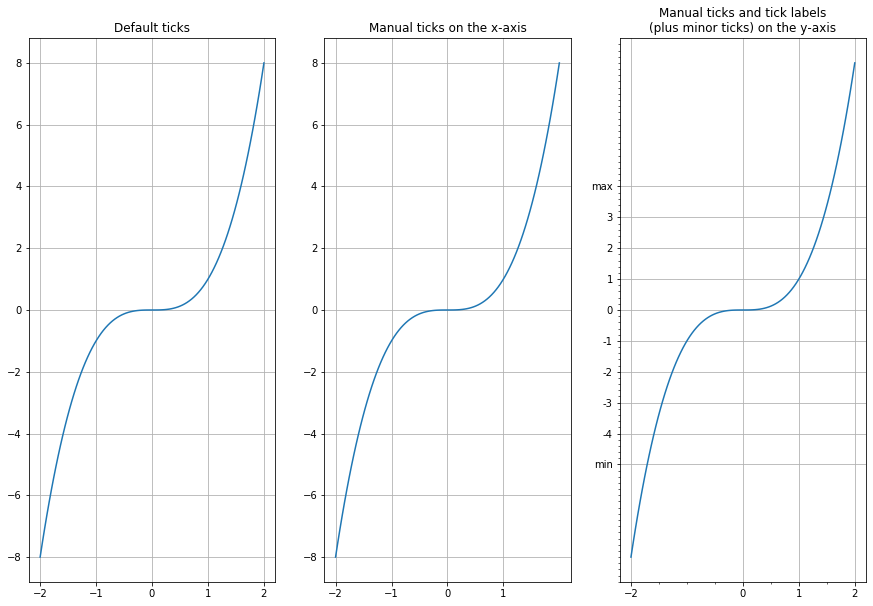
Ticks and tickers
Figure에 점선으로서 알 기 쉽게 눈금을 표시해주는 marks를 “tickers”라고 표현한다. 이러한 Line또한 사용자가 직접 지정할 수 있다.
1
2
3
4
5
6
7
8
9
10
11
12
13
14
15
16
17
18
19
20
21
22
23
24
25
26
27
x = np.linspace(-2, 2, 100)

plt.figure(1, figsize=(15,10))
plt.subplot(131)
plt.plot(x, x**3)
plt.grid(True)
plt.title("Default ticks")

ax = plt.subplot(132)
plt.plot(x, x**3)
ax.xaxis.set_ticks(np.arange(-2, 2, 1))
plt.grid(True)
plt.title("Manual ticks on the x-axis")

ax = plt.subplot(133)
plt.plot(x, x**3)
plt.minorticks_on()
ax.tick_params(axis='x', which='minor', bottom='off')
ax.xaxis.set_ticks([-2, 0, 1, 2])
ax.yaxis.set_ticks(np.arange(-5, 5, 1))
ax.yaxis.set_ticklabels(["min", -4, -3, -2, -1, 0, 1, 2, 3, "max"])
plt.title("Manual ticks and tick labels\n(plus minor ticks) on the y-axis")


plt.grid(True)

plt.show()
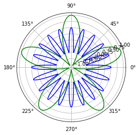
Polar projection
projection attribute를 ‘polar’로 설정함으로서 극좌표계로서 Figure를 표현할 수 있다.(plt.figure에는 존재하지 않고 plt,subplot에 존재한다.)
1
2
3
4
5
6
7
radius = 1
theta = np.linspace(0, 2*np.pi*radius, 1000)

plt.subplot(111, projection='polar')
plt.plot(theta, np.sin(5*theta), "g-")
plt.plot(theta, 0.5*np.cos(20*theta), "b-")
plt.show()
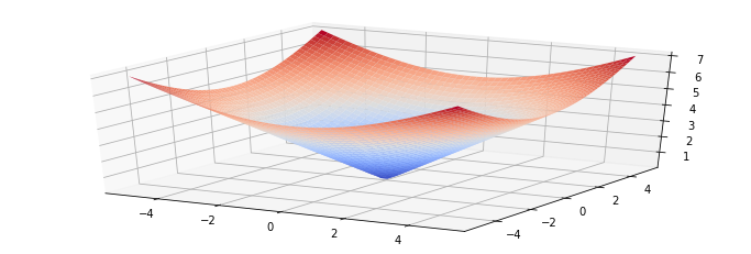
3D Projection
3D graph를 그리기 위해서는 Axes3D Module을 불러와야 되고 plt_surface에 x,y,z,coordinates,optional attributes를 Input으로 넣어서 확인할 수 있다.
1
2
3
4
5
6
7
8
9
10
11
12
from mpl_toolkits.mplot3d import Axes3D

x = np.linspace(-5, 5, 50)
y = np.linspace(-5, 5, 50)
X, Y = np.meshgrid(x, y)
R = np.sqrt(X**2 + Y**2)
Z = R

figure = plt.figure(1, figsize = (12, 4))
subplot3d = plt.subplot(111, projection='3d')
surface = subplot3d.plot_surface(X, Y, Z, rstride=1, cstride=1, cmap=matplotlib.cm.coolwarm, linewidth=0.1)
plt.show()
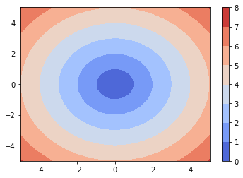
간은 Dataset을 Z축에서 바라본 방향으로 Projection하여 Courtour plot으로 나타내는 방법이 있다.
1
2
3
plt.contourf(X, Y, Z, cmap=matplotlib.cm.coolwarm)
plt.colorbar()
plt.show()
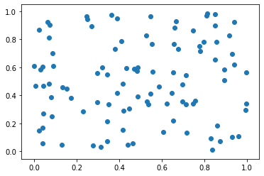
Scatter plot
x,y의 좌표를 Input으로 Scatter plot을 그릴 수 있다.
1
2
3
x,y = rand(2,100)
plt.scatter(x,y)
plt.show()
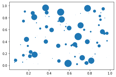
각각의 Point에 Scale을 줄 수도 있다.
1
2
3
4
x, y, scale = rand(3, 100)
scale = 500 * scale ** 5
plt.scatter(x, y, s=scale)
plt.show()
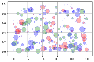
scatter plot역시 다양한 attributes가 존재한다. 투명도, 색 등.
1
2
3
4
5
6
7
8
for color in ['red','green','blue']:
    n = 100
    x,y = rand(2,n)
    scale = 500.0*rand(n)**5
    plt.scatter(x,y,s=scale,c=color,alpha=0.3,edgecolors='blue')

plt.grid(True)
plt.show()
Lines
기본적으로 matplotlib에서 Lines를 그리는 것을 제공하지만, hlines(가로선), vlines(세로선)으로서 그릴 수 있다.
또한 대부분의 경우 Function을 만들어서 원하는 Lines를 그릴 수 있게 한다.
plt.gca()를 사용하게 되면, plt Object자체를 넘길 수 있다.
1
2
3
4
5
6
7
8
9
10
11
12
13
14
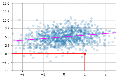
def plot_line(axis, slope, intercept, **kargs):
xmin, xmax = axis.get_xlim()
plt.plot([xmin, xmax], [xmin*slope+intercept, xmax*slope+intercept], **kargs)
x = randn(1000)
y = 0.5*x + 5 + randn(1000)*2
plt.axis([-2.5, 2.5, -5, 15])
plt.scatter(x, y, alpha=0.2)
plt.plot(1, 0, "ro")
plt.vlines(1, -5, 0, color="red")
plt.hlines(0, -2.5, 1, color="red")
plot_line(axis=plt.gca(), slope=0.5, intercept=5, color="magenta")
plt.grid(True)
plt.show()
Histogram
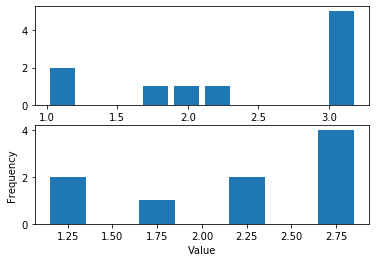
Histogram은 일정한 범위 안의 몇개의 값이 포함되어있나를 표현할 때 쓰는 그래프이다.
bins attributes를 통하여 직접 범위를 정하거나, 일정한 간격으로 나누도록 설정할 수 있다.
1
2
3
4
5
6
7
8
9
10
data = [1, 1.1, 1.8, 2, 2.1, 3.2, 3, 3, 3, 3]
plt.subplot(211)
plt.hist(data, bins = 10, rwidth=0.8)

plt.subplot(212)
plt.hist(data, bins = [1, 1.5, 2, 2.5, 3], rwidth=0.4)
plt.xlabel("Value")
plt.ylabel("Frequency")

plt.show()
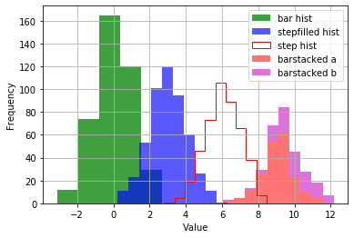
matplotlib.pyplot.hist에 가면 Histogram의 다양한 Option을 자세히 살펴볼 수 있다.
1
2
3
4
5
6
7
8
9
10
11
12
13
14
15
16
17
18
19
data1 = np.random.randn(400)
data2 = np.random.randn(500) + 3
data3 = np.random.randn(450) + 6
data4a = np.random.randn(200) + 9
data4b = np.random.randn(100) + 10

plt.hist(data1, bins=5, color='g', alpha=0.75, label='bar hist') # default histtype='bar'
# stepfilled hist -> 경계선이 없는 Historgram
plt.hist(data2, color='b', alpha=0.65, histtype='stepfilled', label='stepfilled hist')
# step -> 비어있는 Historgram
plt.hist(data3, color='r', histtype='step', label='step hist')
# alpha로서 투명도를 준 뒤 barstacked Histogram을 사용하면 겹쳐서 표현 가능하다.
plt.hist((data4a, data4b), color=('r','m'), alpha=0.55, histtype='barstacked', label=('barstacked a', 'barstacked b'))

plt.xlabel("Value")
plt.ylabel("Frequency")
plt.legend()
plt.grid(True)
plt.show()
Images
matplotlib.image를 통하여 쉽게 Image에 대하여 접근 가능하고 사용 가능하다.
Image의 경우 .imread()로서 불러온다.
1
2
3
4
import matplotlib.image as mpimg

img = mpimg.imread('my_square_function.png')
print(img.shape, img.dtype)
1
(288, 432, 4) float32
1
print(np.mean(img))
1
0.7349013
불러온 Image는 각가의 pixel이 0~1 사이의 값을 가지고 3개의 Channel(Red, Green, Blue)로서 이루워져있고.imshow()를 통하여 확인할 수 있다.
1
2
plt.imshow(img)
plt.show()
plt.axis('off')를 통하여 axes를 제거할 수 있다.
1
2
3
plt.imshow(img)
plt.axis('off')
plt.show()
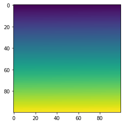
마찬가지로 실제 Image File형식으로 값을 할당하여 만들 수 있다.
이미지의 경우는 이전에 공부하였던 Matplotlib이 더 자세히 나와있다.
1
2
3
4
img = np.arange(100*100).reshape(100, 100)
print(img)
plt.imshow(img)
plt.show()
1
2
3
4
5
6
7
[[   0    1    2 ...   97   98   99]
 [ 100  101  102 ...  197  198  199]
 [ 200  201  202 ...  297  298  299]
 ...
 [9700 9701 9702 ... 9797 9798 9799]
 [9800 9801 9802 ... 9897 9898 9899]
 [9900 9901 9902 ... 9997 9998 9999]]
참조: 원본코드
참조: Handson-ml2 Github
Leave a comment